First Baptist Church Broken Arrow
2024 CAMP LEADER GUIDE
Project Overview
Overview
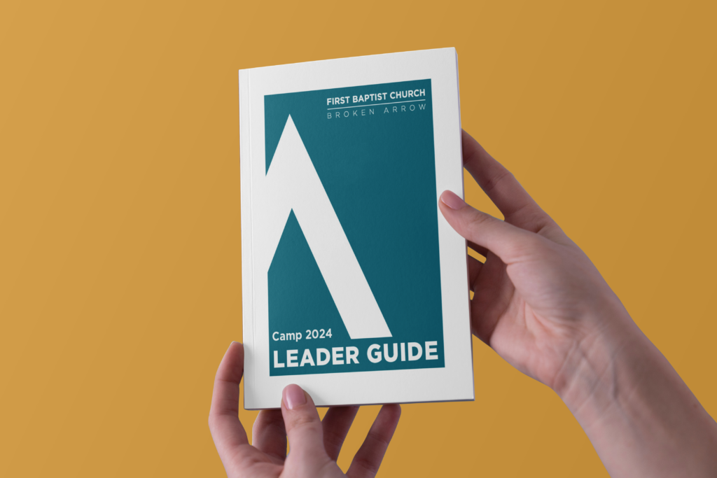
For this project, I collaborated with First Baptist Church Broken Arrow to design their 2024 Camp Leader Guide. This comprehensive guide served as a key resource for camp leaders, blending practicality with a professional yet inviting aesthetic.
Design Approach
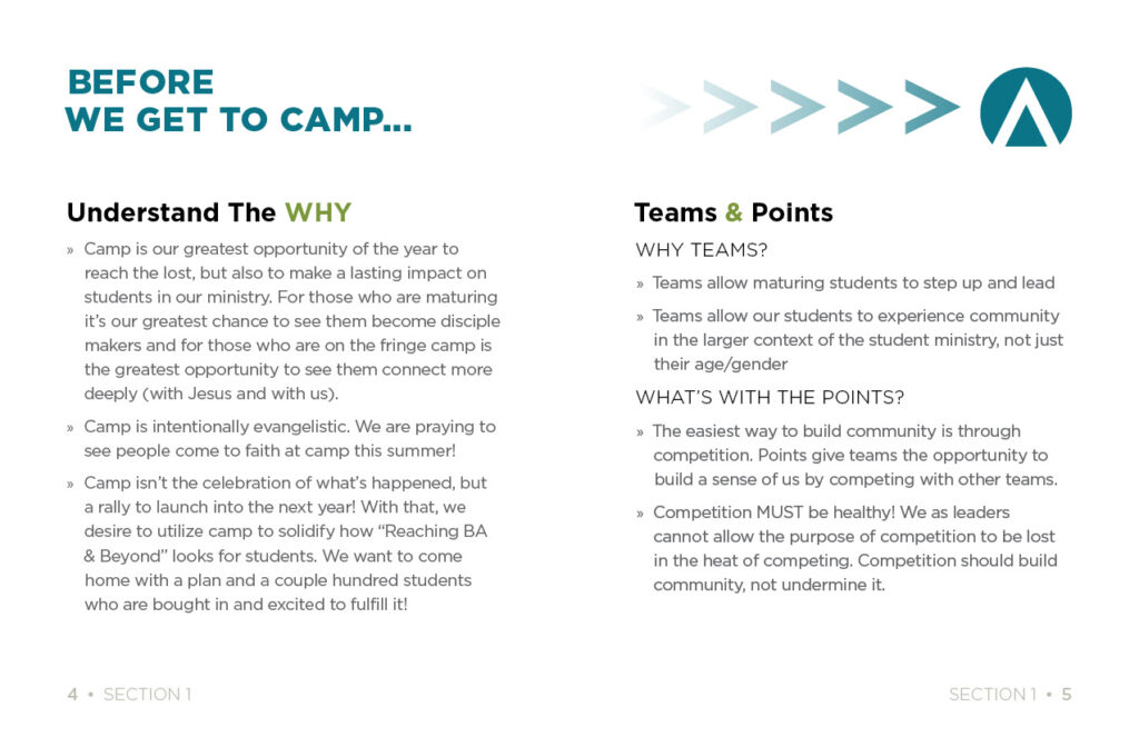
To ensure brand consistency, I sourced all design elements, including fonts and colors, directly from the church’s website. The color palette of blue, green, and gold/yellow became the foundation for the guide, embodying a fresh, happy, and professional tone that aligned seamlessly with the church’s identity.
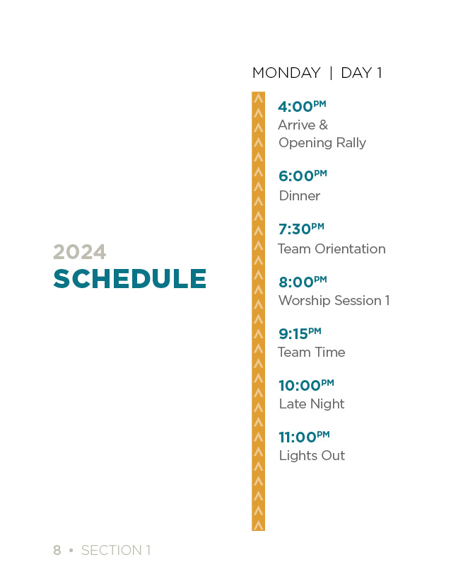
A particularly unique element of this project was the creative use of the arrow icon from the church’s logo. I reimagined this arrow to create multiple graphic elements throughout the guide, adding cohesion and a subtle nod to their branding.
Print-Friendly Features
Understanding the need for flexibility in printing, I designed every page with a thick white margin. This thoughtful detail ensured that whether the guide was printed in-house or professionally, there was no concern about hole punches or spiral binding affecting the layout. The clean margins preserved the integrity of the design in all formats.
Visual and Functional Highlights
Light and Airy Layout
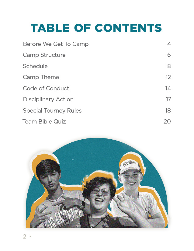
- The overall design embraced a light and airy feel, with ample white space and large, easily digestible fonts. This approach made the guide approachable and reader-friendly.
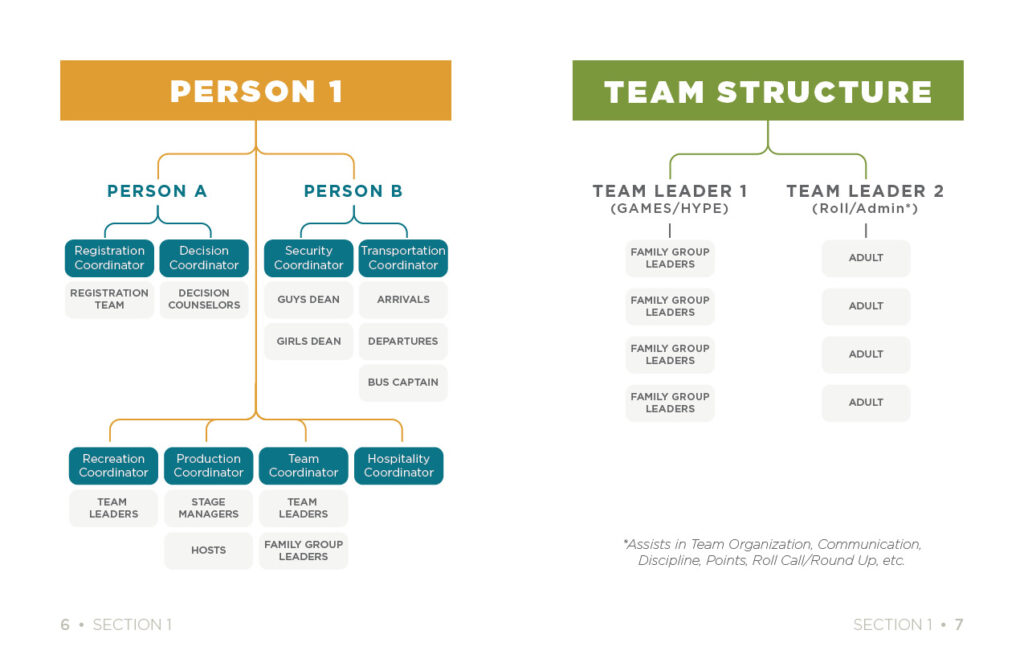
Flowchart Graphics
One standout feature was the inclusion of custom flowchart graphics to illustrate the intended team structure. These visuals simplified complex information, making it easy for leaders to understand their roles and responsibilities.
Clear Navigation
Thoughtfully placed navigational elements enhanced usability, guiding readers effortlessly through the document.
Impact
The intentional application of font and color, combined with practical design choices, resulted in a guide that was fresh and inviting. Leaders could easily engage with the content while appreciating the professional polish of the document. This balance of functionality and aesthetic appeal underscored the church’s commitment to excellence in their camp leadership efforts.
This project was a rewarding opportunity to merge strategic design with the church’s mission, creating a tool that was as beautiful as it was effective.


